


![CALCULATING THE CHANGES. As study habits have changed, the materials used have changed too. "I remember the day when [my brother] came home with his graphing calculator, [which] had Mario. And I was blown away," Spanish teacher Peter Daniels said. (Photos: Fair Use; Wikimedia Commons)](https://www.rubiconline.com/wp-content/uploads/2026/05/Untitled-design-4-1200x800.png)


![BEWARE. Junior Maisy Torres was expecting a Nickelodeon ride when she entered the haunted house at the State Fair. What she encountered was much more horrifying. "There's not enough money in the world to pay me to do [it again]," Torres said.](https://www.rubiconline.com/wp-content/uploads/2026/05/Never-again-with-nabeeha-1-e1778077989386-1200x802.png)


![[QUIZ] What famous scientist are you?](https://www.rubiconline.com/wp-content/uploads/2026/01/Untitled-design-3.gif)


Minnesota state flag is unoriginal, offensive
Email your congressperson for a change

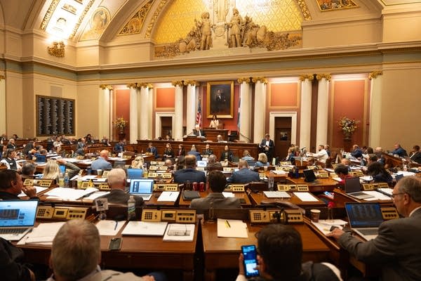
The Minnesota and United States flags fly over Sea Foam Stadium at Concordia University. SPA does not fly a Minnesota flag on it’s flagpole.
Minnesota, like other states, has state symbols: the loon is the state bird, lady’s slipper is the state flower, walleye is the state fish, and, more enigmatically, milk is the state drink and blueberry is the state muffin. These symbols represent the state in ways far beyond their official designation. They remind Minnesotans of the land they share, the pride they feel to be connected to people and place, and bring them together when politics tear them apart. But there’s one state symbol that’s curiously overlooked, and it’s not the state mushroom (morel) or state soil (Lester). It’s the state flag. Why is this symbol, the most important representation of a state, so often forgotten and ignored, only rarely flying in its proper place beneath the Stars and Stripes? Because it’s unoriginal, outdated, ugly, boring, offensive, and getting close to retirement age. The Minnesota state flag needs to be changed.
The flag features the Minnesota state seal on a blue field, surrounded by various state symbols – the state flower, three key dates, the North Star, etc. It drew heavy inspiration from the colors flown by Minnesota’s earliest volunteer infantry regiments in conflicts dating back to the Civil War. In addition to the national flag, each Union regiment carried their own flag, the standard-issue version of which featured an eagle on a blue field with the regiment’s name. The easiest way to personalize the flag, which helped to raise morale as well as making the regiment easier to identify in battle, was to replace the eagle with the seal of the origin state. It was this simple design that Governor Alexander Ramsey presented to First Minnesota at their camp in Virginia, and that likely inspired the original Minnesota state flag, adopted at the 1893 Chicago World’s Fair.
Unfortunately for Minnesota, other states had the same idea. When the background was changed from white to blue in 1957, Minnesota’s flag joined the now 22 other state flags that feature their state seal on a blue background. Despite it being jam-packed with symbolism, the flag fails to represent the state adequately, since it is practically indistinguishable from nearly half of the other state flags in the country.
Even when taken out of context, the flag fails aesthetically. A flag is a state’s brand, its insignia, but the Minnesota flag tries to be too much at once, and in doing so fails to represent the state at all. 19 stars, six flowers, 67 circles, 22 letters, and twelve numbers all crammed into the center of the flag make it so busy that, where the symbolism would otherwise be overly overt, it becomes inscrutable from a distance – so difficult to make out that any Minnesotan would have a hard time extricating anything they love about their state from the gold-tinted mess on a blue field. The North American Vexillological Association, the continent’s leading authority on flag design, agrees. They rated the Minnesota flag 67th out of 72 provincial, state, and territorial flags from the US and Canada. Out of the five Principles, rules of flag design laid out by vexillologist Ted Kaye and featured on NAVA’s website, Minnesota breaks four, most egregiously the first principle: “Keep it simple.” Kaye’s rule of thumb is that a good flag should be so simple, a child could draw it from memory. Minnesota’s flag is so complicated, the original design had to be painted on rather than sewn, leading to an interesting effect where old Minnesota regimental flags aren’t just fading; they’re peeling.
Perhaps it’s a good thing that the paint is slowly removing itself from these artifacts since the seal itself brings up yet another issue with using a flag dating back to the early days of our state: the colonialist overtones. Centered in the seal is a cartoonish scene invoking the age of the Pioneers: a farmer tears upland with his plow, while a Native American flees in the background, wary of the musket the farmer keeps within arm’s reach. The flag was changed in 1983 to depict the farmer and Native American as coexisting, rather than at odds, but the revision failed to remove the musket, and all it accomplished was to push a false narrative of peace between Pioneers and Natives. It was once a gleaming tribute to Minnesotans’ shared heritage, but is now a relic of the past, and should not represent the state as it tries to move forward and make amends for past mistakes.
The movement to change the Minnesota flag is not a new one. The Twin Cities Pioneer Press held contests for new flag concepts in 1989 and 2001. The winner of the 2001 contest, known as the “North Star Flag,” has been used unofficially as an alternate state flag for almost two decades, and can be seen flying in front of houses and at Minnesota United games. A House bill to redesign the flag is currently winding its way through the State Legislature, but it’s expected to be blocked in the Senate since Senate Majority Leader Paul Gazelka, R-Nisswa, is against it. However, that’s not the end of the decades-long movement. Proposals to alter the flag have been brought forward by both Republicans and Democrats in the past, and if Leader Gazelka and other senators can be convinced that a redesign is what their constituents want, the bill might pass. In other words, writing a letter to your local congressman or woman could, for once, make a significant impact. It’s up to the people of Minnesota to make sure they’re represented, not just by politicians, but by their flag, too.

Colin Will is an Opinion Editor on The Rubicon. This is his first year on staff. During the pandemic, he has built a garden, gone bird-watching, verified...