The spaces that shape us: the intersection of architecture and psychology


Winston Churchill seemed to understand the influence of human-designed environments when he declared after the bombing of the British House of Commons in 1943 that, “We shape our buildings, and afterwards, our buildings shape us.” While dated, Churchill’s statement on the influence of human-designed environments on psychology is still relevant today.
The intersection of architecture and psychology falls under the study of “neuro-architecture” or “psychoarchitecture,” in which buildings, rooms and spaces are designed to prioritize human emotion and response. A 2016 study conducted by Roddy M. Grieves and Kate J. Jeffery, entitled “The representation of space in the brain,” found that specialized hippocampal cells in the human brain are specifically attuned to the geometry and arrangement of the spaces they inhabit.
Senior Sophie Nguyen believes that personal inclinations play a significant role in the emotions someone experiences upon entering a space. “If you are trying to build a house for just one specific person, compared to a commercial building, that’s definitely based on personal preference and their own personal psychology and what they like, because I think that it could vary from person to person,” she said.
The study of psychoarchitecture can give a basic estimate of how a wider population might react upon seeing an environment, based on a few guiding principles. First, curves and organic shapes in spatial design create a sense of comfort and connection by mimicking naturally occurring forms, subconsciously directing a person through a space.
Second, harsh lines and angles, common in more modern or commercial buildings, create a colder, more sterile environment, evoking a sense of detachment. For example, Nguyen wants “something less modern” for her own house someday. “That type of architecture kind of gives more of an industrial or clean feeling,” she said.
Third, spaces with a directional flow tend to put people’s minds at ease while spaces lacking in this flow can feel isolating and disorienting. A famous example of disorienting architecture is the Seattle Public Library. Designed by Dutch architect Rem Koolhaas in partnership with local architects, the 11-floor library is constructed with steel and glass to form an hourglass shape. Despite earning many architectural distinctions, the interior design, shelving and pathway layouts create an awkward flow of movement that confuses visitors.
Beyond these three main principles, individuals are also strongly influenced by the facade, or outside impression, of a building or street. Their first impression can strongly influence how they perceive the rest of the building and, in turn, affect their mood. More monotonous or boring facades are usually associated with lower excitement and happiness, as flat surfaces lack points of interest or connections that catch people’s eyes.
Conversely, more lively, colorful and eye-catching facades are associated with a mood boost. Lighting, color and texture can all influence how a space is perceived.
Sophomore Hank Harp is most intrigued by Gothic architecture, fascinated by its ornate details and intricate points of interest. “I notice if [architecture looks] really cool, [for example] St. Peter’s Basilica. I really don’t like … brutalist or sometimes some hellacious building[s],” Harp said.
In city architecture, greenery and parks are also integral to lifting moods. Spaces that reconnect with nature and other people help with overall health. Park designers have even coined the term “triangulation” as a technique for designing green spaces with the specific intent of encouraging people to gather and interact more often.
These foundational principles of psychoarchitecture can be employed in many different ways, appearing in both popularly frequented places and in the media one consumes.
The most common example of psychoarchitecture utilized for a specific purpose is casinos. Casinos are designed with the intention of luring and keeping people in their buildings. Their extravagant facades, usually built with a theme, are purposefully loud and bright to draw attention. Conversely, the interiors of casinos are relatively tame and calm, with soft lighting, a maze of machines and furniture. No windows or clocks to make people stay longer and lose track of time, all the while funneling money into the casino.
“I’ve heard of the casino thing. I feel like [it’s] more of a money-making thing,” Nguyen said.
Beyond regular buildings, psychoarchitecture also appears in the media audiences watch, most notably in reality TV shows. “Big Brother” is a show where contestants live together in a specially built house, competing to win a cash prize.
Analysis by Stewart Hicks, an associate professor of architecture at the University of Illinois, reveals that the angles and rooms in the house are unique because they are specifically designed to minimize isolation and private spaces. While more connections and open areas might sound nice in a personal home, in a communal space housing 16 contestants, a lack of privacy and alone time breeds conflict.
Similarly, shows like “Love is Blind” and “The Circle” both utilize architecture purposefully to push people together and apart at certain moments to orchestrate stronger emotional responses they can use to dramatize their content. “Love is Blind” uses its signature isolation pods when contestants first meet their prospects to lull them into feeling more comfortable expressing their feelings, while “The Circle” uses its minimalist apartment designs to further emotionally distance its contestants.
Movies, on the other hand, often hire professional concept artists to design settings that fit the aesthetics of the film. Well-incorporated environments add to the immersion of the movie, leaving a lasting impression on audiences. “Star Wars” is one such film for Harp. “In one of the Star Wars films, there’s a palace that has really, really nice architectural elements for [a] palace,” he said.
Like Harp, Nguyen believes there are benefits to paying attention to the visual environments that directors and creators deliberately create in media, whether in movies or TV. “My visual narratives class [is] doing a shot-by-shot project, and I think … just paying attention to different fictional architectures [is helpful],” Nguyen said.
Environments play a large role in how people feel and their emotions tend to reflect the mood of their surroundings, whether fictional or real. Looking at fantastical structures in real life or on a screen both impact the perceiver.
Cross-cut edges. 15X14 dimension and exposed brick. To a student, small details like these can seem insignificant. After all, a small architectural incision on an entrance doesn’t scream intention.
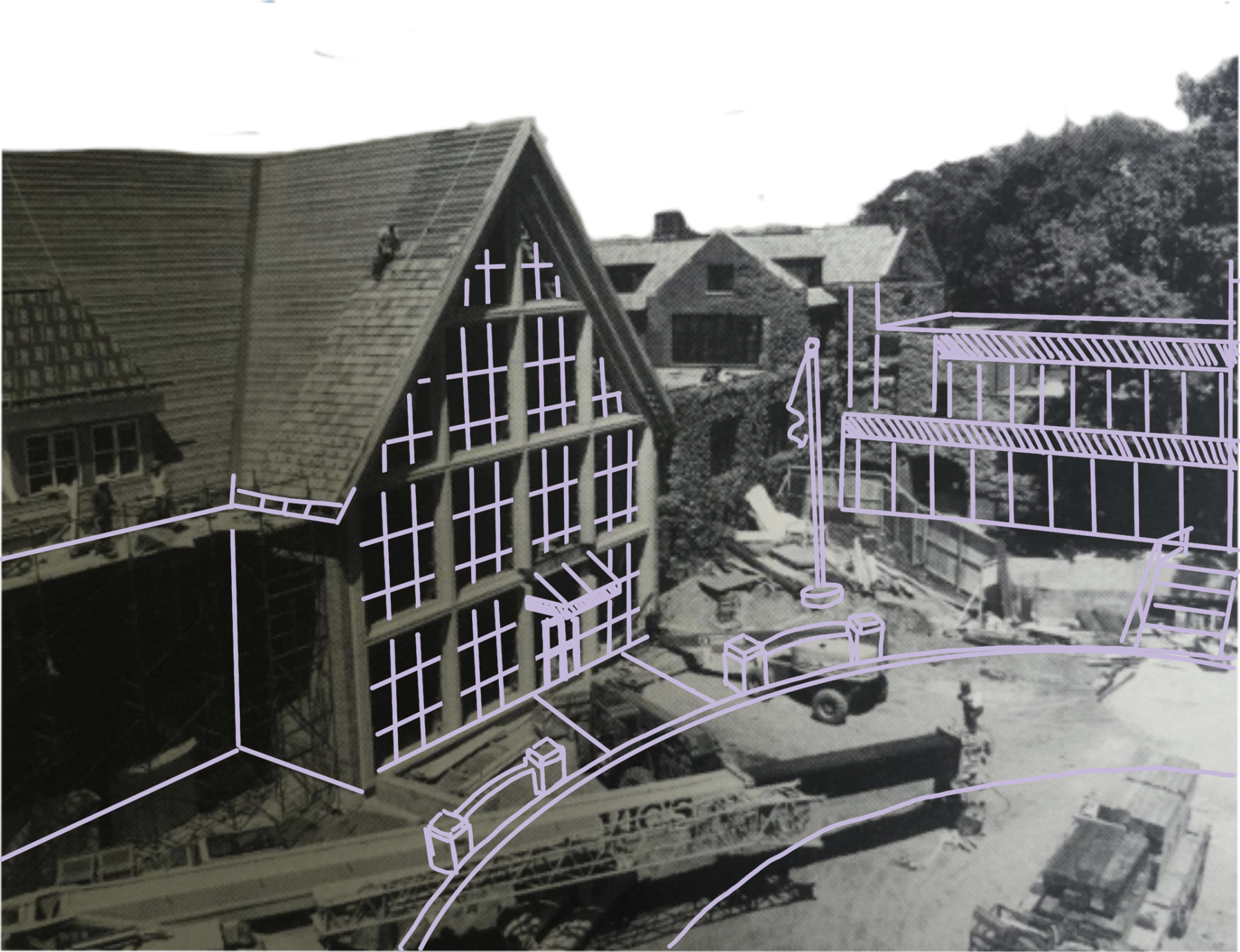
But the spaces students move through every day were never accidental. Many of them were born out of the moments when the school realized its programs had outgrown the rooms meant to hold them.
When Director of Institutional Advancement Sarah Johnson, who has worked at SPA for 16 years, first arrived in 2009, a major change was already underway. At the time, concerts were held in the gym, senior speeches were delivered under the fluorescent lights meant for athletics and theater productions were staged at the lower school or off campus.
“We really wanted a facility that would support this incredible program and curriculum we have for music and the fine arts,” Johnson said. That desire eventually materialized into the Huss Center for the Performing Arts, which opened in 2015.
The design of the space was not simply aesthetic; it was intentional. Faculty met directly with architects from the Hammel, Green and Abrahamson design firm to outline what teaching actually required.
“Our performing arts faculty were in meetings with the architects and with the construction companies to share, ‘This is the vision. This is what we need to do, to support the kind of program we have,’” Johnson said. Elements, down to acoustic panels, that were installed with adjustable curtains to allow sound to be brightened or dampened, were thought out.
“Storage wings were built so sets would no longer be tucked into closets. Every technical decision reflected a pedagogical one,” Johnson said.
Brooks Chair in Visual and Performing Arts Almut Engelhardt found the process of working with architects relatively easy, because the department had spent years performing in different venues across the Twin Cities. “We had been in several halls before, because we couldn’t fit at the lower school anymore, and we didn’t have a hall here,” Engelhardt said.
“So what we could do was to say, here’s the hall that works really well for us here, and this is what’s in common. We want that.”
Rather than dictating elements of design, the faculty focused on function. “We’re not architects, so we couldn’t tell them what to do, but we can tell them what works for us … and they were good at taking that into consideration,” Engelhardt said.
Still, a few details that teachers played a role in including were the slight slant the auditorium has in Huss. Making rows in the back higher and slowly descending to lower spaces created room for chairs in the front. “We wanted a hall with a slant, so that everybody could see,” Engelhardt said. Other elements included soundboarding, which was needed to accommodate events ranging from jazz band performances and theater plays to senior speeches. HGA found a way to balance acoustics so the hall wouldn’t be too lively or too muffled.
However, the construction did not only bring a flashy stage; other features include backstage access, a scene shop, rehearsal rooms, makeup spaces and fixed theatrical light rooms, a stark contrast from performing in a gymnasium. “We didn’t have a stage that had all the lighting and everything that you could need to put on a really nice performance,” Engelhardt said. “We didn’t have comfortable seats to sit on for the audience. We had bleachers. The difference is huge.”
The same pattern unfolded in the Schilling Math and Science Center. Before its construction, many math classrooms had no windows. Desks were fixed in place. Teachers prepped lab materials in the back of classrooms while other classes were in session because there was nowhere else to go.
“One of the stories I remember is that the math center used to be where World Languages is right now; most of the classrooms didn’t have any windows, and they were really small rooms,” Johnson said. “What I’ve noticed in most of the intentions with facilities is that the program has grown and expanded to a point where we don’t have the facilities that support the incredible work.”
Now, whiteboard walls stretch across classrooms, leaving the remnants of students’ contributions. Screens allow students to present and share their thinking. Dedicated prep spaces in science classrooms separate planning from instruction.
The architecture throughout the school has responded to the emphasis on subjects and has allowed students many more luxuries. Programs no longer adjust to rooms, but spaces were designed with programs in mind.
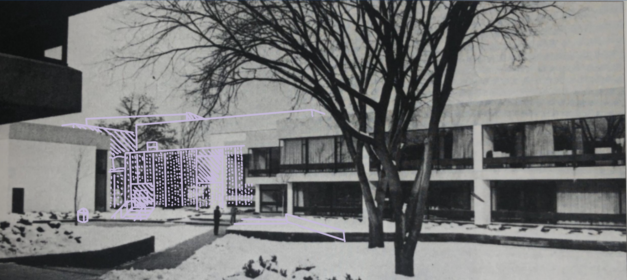
Even stylistically, each addition to campus reflects a moment in the school’s evolution. “Each era and each facility has kind of nodded toward different areas,” Johnson said. The 1969 modern wing, or where the library and world languages classes are currently held, marked the merger of the formerly separate boys’ and girls’ schools.
The middle school nods to the original brick aesthetic of Old Main. The Huss and Schilling Center represents the sharper and modern style HGA brought in the 1970s.
Facilities Manager Pete Kilibarda has noticed a change in the community throughout his time. “Students and teachers have more spaces to meet, from small groups to large groups,” Kilibarda said.
However, alumni still sometimes return to school and find it unrecognizable. “They come into school, they’re like, ‘Where’s my school?’ They can’t recognize anything,” Johnson said. Trees were moved to make space for new construction. A former open student center in the fine arts area was closed in to create practice rooms. Small changes like these add up throughout the years.
In that way, the campus’s design tells two stories, one about the expansion and advancement of learning and the other about continuity and tradition. As students file through different wings, moving to get to their next obligation, each space they enter and leave reveals the school’s values since its beginning.

![CALCULATING THE CHANGES. As study habits have changed, the materials used have changed too. "I remember the day when [my brother] came home with his graphing calculator, [which] had Mario. And I was blown away," Spanish teacher Peter Daniels said. (Photos: Fair Use; Wikimedia Commons)](https://www.rubiconline.com/wp-content/uploads/2026/05/Untitled-design-4-1200x800.png)